Graphic designer Ilkka Kärkkäinen: “Our society craves for things to feel like something”
Ilkka Kärkkäinen is the head of the jury of the Paimio Sanatorium 90 poster competition. He believes a powerful idea is the most important thing in a good poster.
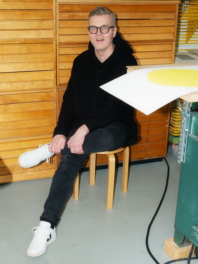
GRAPHIC DESIGNER Ilkka Kärkkäinen worked for years at an advertising agency, until a few years ago he began a new period of slower and more measured work. He acquired old equipment and studied the letterpress printing method of bygone times. Currently he works with art graphics and commercial graphics. Kärkkäinen is also the head of the jury of the Paimio Sanatorium 90 – Human Perspective poster competition, and the collective he founded, so_helsinki, is the creative partner of the competition.
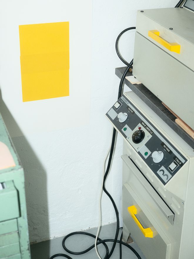
Ilkka Kärkkäinen works in Vallila, Helsinki, in an old factory building, today providing working space for several dozen artists. The place is shared by a varied group of professionals: in the open working area of about 200 square meters, people draw letters, design spaces and make illustrations and papier-mâché sculptures.
One end of the room seems interesting even for the uninitiated: numerous old chests of drawers filled with type, and also the proof presses, seem like going back to a time when people used to say “Easy does it”. Kärkkäinen has not only saved a piece of valuable culture, he is also breathing life into it.
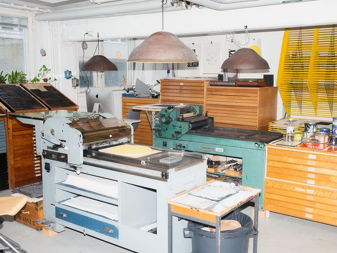
The studio is located in an old industrial building in Vallila, Helsinki.
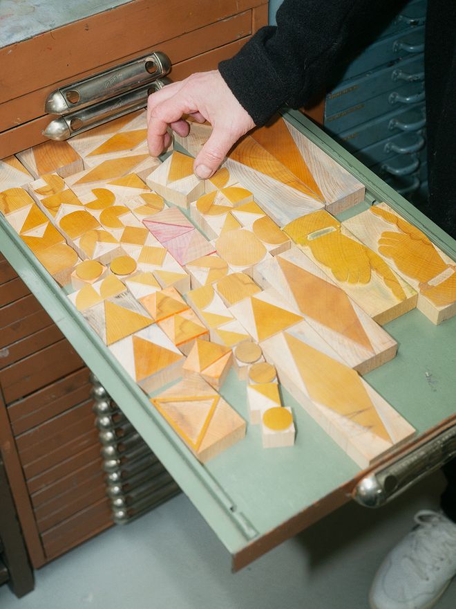
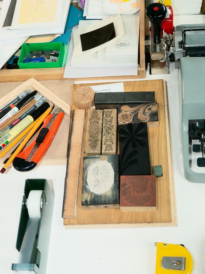
The wooden letterpress blocks were made as a tribute to the Romanian sculptor Constantin Brâncuși (1876–1957), reflecting the artist’s characteristic style.
Ilkka’s graphic expression has always arisen through shapes and colors. He believes in deliberate simplification.
Hi Ilkka! Thanks for letting us visit your studio. This is not quite the standard open-plan office! You’ve even got century-old, massive machines to do your work with. Why’s that?
“When I ended my career of thirty years at an advertising agency, I knew right away that I wanted to work more slowly and use analog methods. This resonates in society also in other ways and can be seen in the work of photographers and musicians, for example. We miss tangible things. There’s been talk of the death of the book and even magazines for a long time, but I don’t see it happening.
I call my current work a slow printing method, although you can never get away from the busy pace of life. However, I make an attempt at doing things more slowly, in a measured and sustainable way.”
“It’s great to bring together people from different fields and to observe how we learn something new and inspiring from how other people go about their work.”
So your background is in the advertising business and now you work on art graphics and commercial graphic design. It sounds so fresh and versatile!
“I’m interested in the space between art and commerce, and the ways in which the two intertwine. I have been following both worlds along the years and tried to understand the huge chasm between them. I have been wondering if there can be channels to combine the two.
Based on these thoughts, I founded the so_helsinki collective with my partner, artist Veera Kulju. We do work project basis and know many of the best professionals in the business, and always compile a team for each project. It’s great to bring together people from different fields and to observe how we learn something new and inspiring from how other people go about their work.
We’ve kind of kept the doors open. In my previous career, it felt that working for an advertising company involved a lot of secrecy, working behind closed doors so as not to reveal anything. We wanted to do the opposite and invite people over, keep an open mind and share things. It feels really good, and I’ve learned more in two years than the past ten before that.”
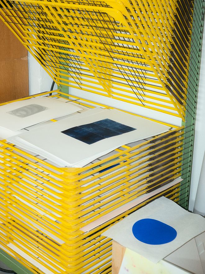
Fresh prints are placed on a dedicated drying rack. Ilkka’s work straddles the realms of art and commercial prints, often occupying the space in between the two.
In his studio, Ilkka often organizes workshops where participants can try out relief printing techniques and their numerous possibilities.
“The Aaltos were much ahead of their time, even futuristic,” Ilkka says. “It’s a bewildering thought that someone can create something that can stand the test of time for a century and beyond.”
You’ve designed the logo for the Paimio Sanatorium in which a beautifully curving shape draws the letter P and expresses in a simple form something essential. What kind of designer are you and what kind of outcome do you aim to achieve?
“As a designer, I tend to veer towards the classics and the older I get, the more minimalistic my work becomes. I don’t want to have anything superfluous in my work, and I get rid of any extra forms and effects right from the start. That has always been a part of my working method. Minimalism is not considered a particularly commercial style. I have sometimes had to tell customers outright that it takes a lot of courage to leave things out instead of putting in more embellishments.
Receiving the commission for the Paimio Sanatorium was a great honor to me and I was thinking to myself how I’d manage it. I realized that I had to outsource myself: I couldn’t just add some little snippet alongside what the Aaltos had already designed, but instead, I drew a form that Alvar Aalto had already created. I take great delight that the outcome was not actually designed by myself, but Alvar.
This is foremost in my mind. My job and goal is to design things that do not particularly look like they were designed by me, but rather the best possible solution for any particular situation.”
“I’m impressed by how much ahead of their time the Aaltos were, even futuristic.”
What in the work of the Aaltos has had the greatest impression on you?
“I’ve read about Alvar’s thoughts and been impressed by how much ahead of their time the Aaltos were, even futuristic. It’s a bewildering thought that someone can create something that can stand the test of time for a century and beyond. New generations will find the same magic of the Aaltos, still as fresh as the day it was designed. The things they designed and their carefully planned solutions are just as contemporary in today’s context.”
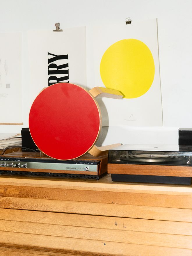
First introduced in 1933, the Aalto stool was a sensation in the design world of its time.
Founded by Ilkka and his partner, artist Veera Kulju, so_helsinki has designed the graphic identity for the Paimio Sanatorium 90 competition.
Ilkka suggests that anyone interested in the poster competition should familiarize themselves with the design philosophy of the Aaltos and, of course, also with the Paimio Sanatorium.
You are head of the jury in the poster competition in honor of 90 years of the Paimio Sanatorium and Grafia. Could you tell us something about the poster as a format?
“About a century ago, the poster was probably the most common form of media. It was used to communicate about things. The cityscape was filled with posters, with specific locations, walls and poster pillars for putting them up on. For example, any self-respecting theater had its own graphic artist that created play posters with piety. Today, almost all of this has changed. Graphic designers still get commissions, but for different reasons.
I’m by no means saying that everything should be done as before, but it’s more about valuing their craftsmanship. I consider the poster to be a kind of basic format. As digital environments are gaining more ground, the poster has lost prominence, so this is our way of bringing it back to the level it deserves to be.”
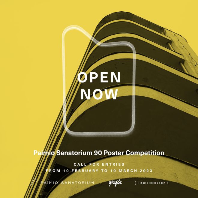
• Read also: The Paimio Sanatorium and Grafia turn 90 – enter a poster competition! >
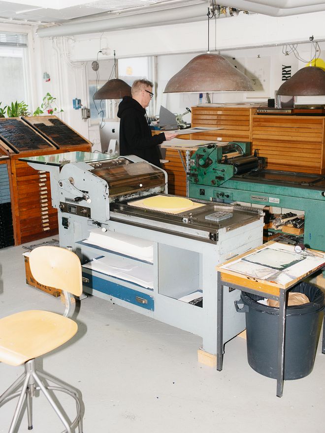
One end of the shared workspace is Ilkka’s kingdom. Over the past couple of years, he has acquired used, old printing machines and accessories, and even large quantities of old paper.
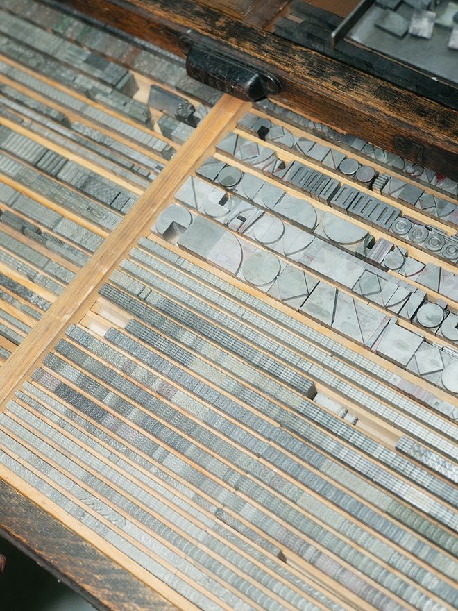
This hundred-year-old type case houses a series of decorative typefaces with geometric shapes, created as an extension for the Futura typeface from the 1930s.
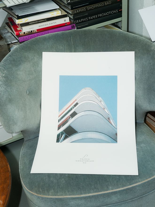
The Paimio Sanatorium logo was designed by Ilkka Kärkkäinen.
Can you think of a particular poster that you found particularly good?
“Maybe one of the most famous was the anti-war poster campaign in the 1960s by Yoko Ono and John Lennon. The strong message in black letters on white background read: War is over! If you want it. The poster paid for by Ono and Lennon was put up on billboards around the world.
Is it essential for a poster to have a message?
“One form of the poster is the propaganda poster with a strong opinion or position. That’s one way of going about it, but by no means the only. There are also posters that use imagery to create a brand for a company. A typographic poster that contains a message is another genre. In the Lennon and Ono poster campaign, the thought behind it was the most powerful, and I like the simplicity of it. If the matter at hand is so powerful and important, I find it only great that it wasn’t spoiled with any frills.”
“Old hands tend to say that a poster works well and is good if it works just as well on the side of a matchbox.”
I have an idea that there are plenty of definitions of what variables must be present in order for a poster to be good. Is this true? What makes for a good poster?
“Old hands tend to say that a poster works well and is good if it works just as well on the side of a matchbox. I’ve also heard plenty of other rules. In 2006, I was in the jury of the 2006 Cannes Lions Festival Outdoor category. During the week we went through some 5,000 entries. We all know that there are plenty of definitions for the composition, colors, contrasts, symbolism etc.
Once we were done, we realized that all winning entries broke against the rules we thought were there. Maybe this witnesses of the power of the idea. When the idea is powerful, it suddenly makes no difference how it’s done.”
“A good designer has an understanding and vision of the larger context,” Ilkka believes. “That they understand widely, for example, architecture, art, photography and graphic design.”
Ilkka, we’ll let you back soon to your printing machine. But finally, please say a few words to people planning to submit a poster to the competition!
“I want to encourage you. Remember that any method is allowed: it may be graphics, photography, even an oil painting or a combination of all these or a typographic poster.
The competition theme, Human Perspective, is quite an abstract concept that may not be so easy to visualize, but it is closely related to the design philosophy of the Aaltos. I recommend that you learn as much as possible about design by the Aaltos and about the Paimio Sanatorium, and earlier posters made of Aalto exhibitions. Best of luck!”
Last days – enter the poster competition!
You can participate in the Paimio Sanatorium 90 – Human Perspective poster competition from 10 February to 10 March, 2023. How to enter the competition? Please check the detailed instructions on the Paimio Sanatorium website. The total prize sum is 10 000 euros.
The competition is organized by the Paimio Sanatorium Foundation. Its lead partner is Grafia – Association of Visual Communication Designers in Finland, with Finnish Design Shop as a partner. The creative partner for the competition is so_helsinki.
See also:
• The Paimio Sanatorium and Grafia turn 90 – enter a poster competition! >
• so_helsinki on Instagram >
Published on 3 Mar, 2023