The new hues of the home: try these surprising color combinations today
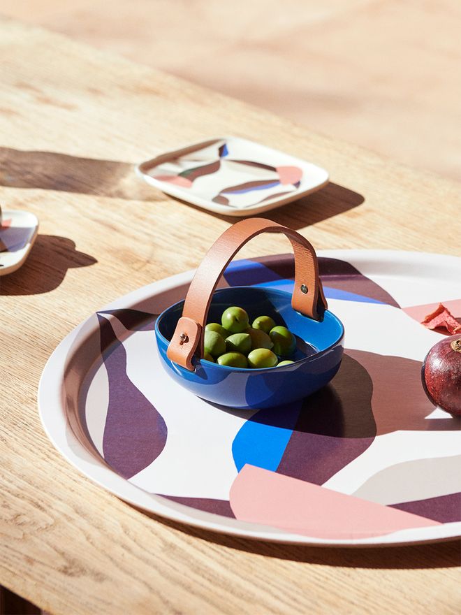
Marimekko's pre-fall collection unites electric blue and soft shades of red for an effortless but energetic mood. The Pikku Koppa serving dish is designed by Sami Ruotsalainen and the Berry tray is adorned with Antti Kekki's vibrant print.
Electric blue + pink
Fresh electric blue has been on the trend radar of color enthusiasts during the season – and for a good reason. The energizing shade looks wonderful when combined with earthy browns and beiges, but also forms a particularly irresistible color pair with powdery pink or blush.
• All electric blue products >
• All pink products >
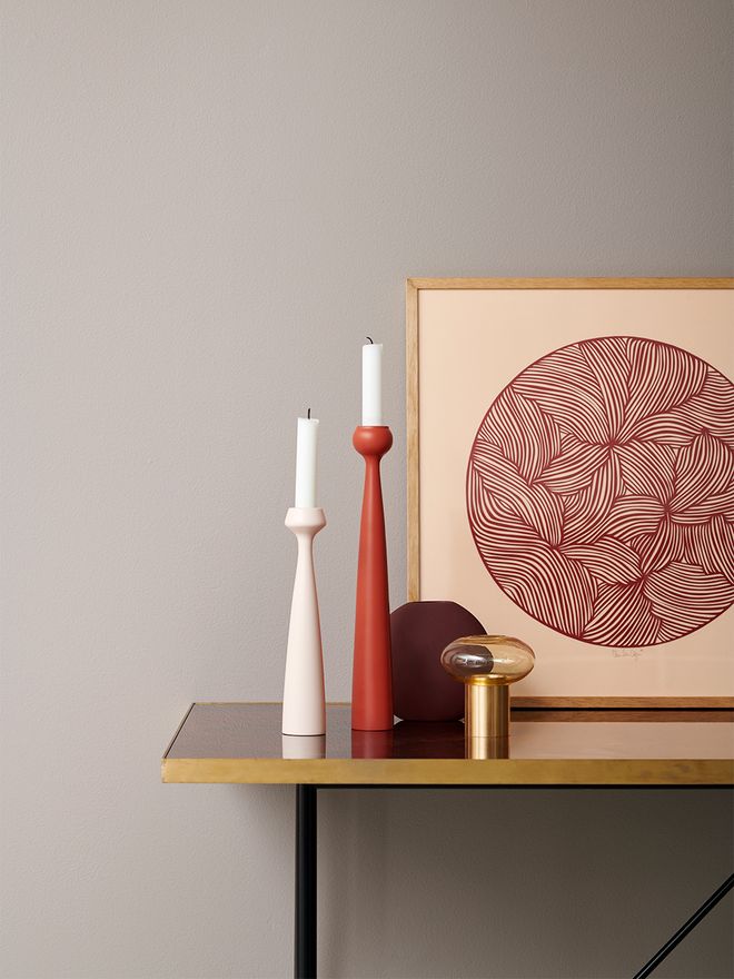
Details have a sizeable impact on the decor and they also provide a safe space for experimenting. The wide variety of shades in applicata's Blossom collection makes it easy to pick the perfect pair of colors.
Pale pink + coral
Don't leave cotton candy hues at the candy store – they are quite the credible option for home decor as well. The soft look of pink can be enhanced and contrasted by an eye-catching, orange-tinged coral tone, which also works perfectly as a partner for lavender and turquoise. Choose a lighter hue for a happy, warm summer mood, or opt for a bolder pair by combining pink with a deeper shade of coral.
• All light pink products >
• All coral products >
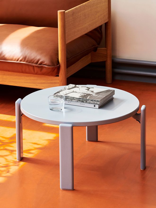
Juicy orange is a bold tone but blended with powdery light blue hues it will knock your socks off. HAY's Rey coffee table in a slate blue hue draws inspiration from an iconic 1970s design by Bruno Rey.
Orange + light blue
There is something delightfully retro about the combination of cheerful orange and lovely light blue. Add chocolatey brown tones to the mix and freshen up with a touch of bright white for a cozy and surprisingly soothing color palette that invites you to relax. Try light blue also paired with bright lime green, you might be surprised!
• All orange products >
• All light blue products >
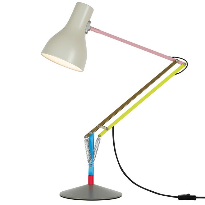
A skillful mix of neon shades, pastel hues, and bright primary colors, Anglepoise's Type 75 Mini, Paul Smith Edition 1 table lamp was created by fashion designer Paul Smith.
Neon + pastels
Attention-grabbing neon colors may not be to everyone's liking at first glance, but in small doses and softened with pastel shades, they can bring attitude and energy to even a more minimalist interior. A sumptuous combination can also be created by pairing muted tones with neon colors: try, for example, a combo of neon orange and caramel brown.
• Products in neon colors >
• Products in pastel shades >
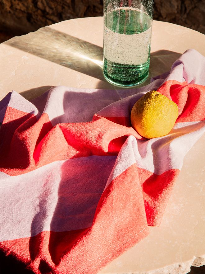
Ferm LIVING's Hale kitchen textiles introduce inspirational color combinations.
Red + lavender
Lavish lavender looks wonderful next to sandy tones and gray, but a bold decorator opts for pure red to pair with the soft purple hue. Take the refreshing combination for a test run with ferm LIVING's charming Hale kitchen towel or place a lush bouquet of red poppies in Muuto's lilac Kink vase. Do also try to combine lavender with dark or bright green, you won't regret it!
• All red products >
• All lavender products >
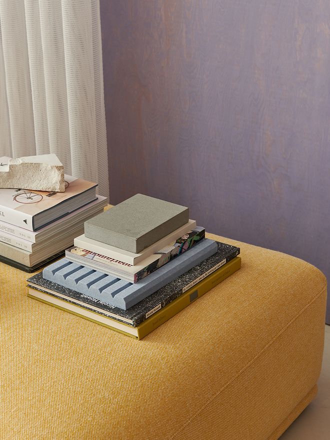
Muuto always has a keen eye for color trends. Their Connect sofa, dressed in a delightfully warm yellow upholstery, looks stunning against the purple wall.
Purple + yellow
Once you get a taste of purple, you might soon find yourself looking for a second helping. Whether it's a pale pastel lilac or a deep amethyst shade that appeals to you, cheerful yellow is a perfect match. Pair an almost orange ochre hue together with muted purple for a serene and bohemian atmosphere, or go for a mood-boosting lemon sorbet yellow to create freshness and fun.
• All purple products >
• All yellow products >
See also:
• What's New at Finnish Design Shop >
Text: Mira Ahola Images: Manufacturers
Published on 18 Jul, 2022