Column: Confessions of a color-shy home decorator
“In choosing colors, I firmly believe in harmony and restraint,” writes Design Stories columnist Hanna-Katariina Mononen.
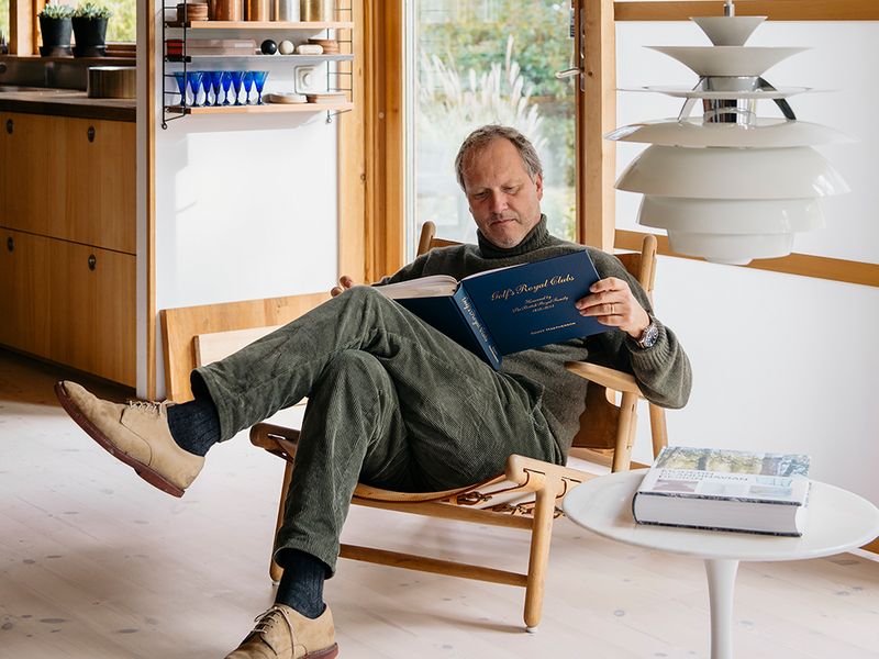
A FRIEND ONCE DESCRIBED me as someone who does not like colors. And this is certainly how it appears at first glance: the color scheme in my home could be justly described as “potato covered in soil”, and the most striking color in my closet is navy blue.
But beyond first appearances, my friend’s impression completely misses the mark. I admit that I find it easy and safe to stick to a color palette that relies on the natural tones of materials, and on tones derived from these that are considered neutral. Although I don’t use an abundance of colors in my own living environment, I still admire the skillful use of color from a distance, and consider it an artform.
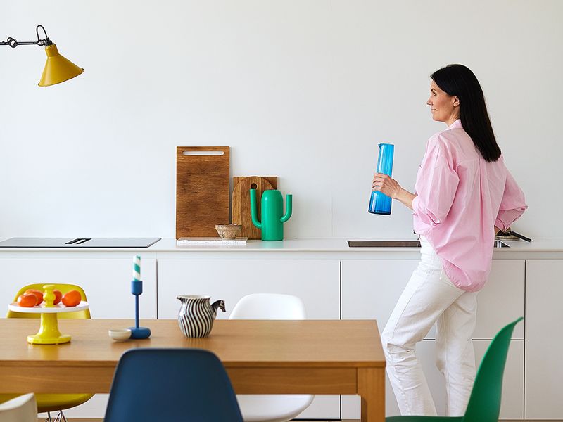
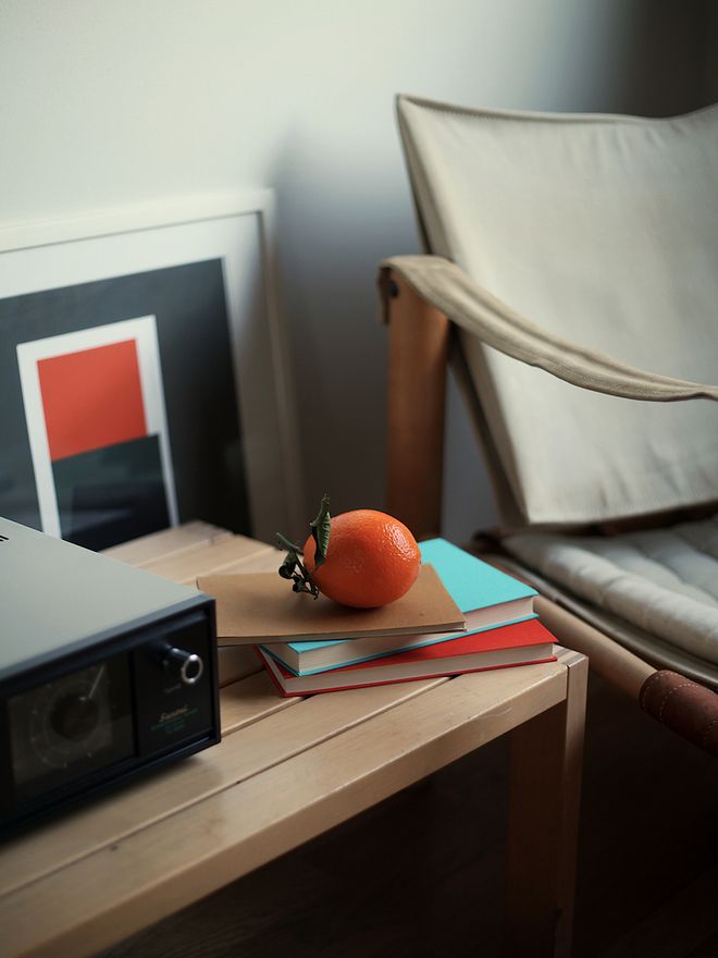
An intense cobalt blue looks absolutely stunning when paired with neutral browns, as do dark green and glowing orange when used side by side. In choosing colors, I firmly believe in harmony and restraint. It would be easy to pick and mix colors like candies, but the best home decor results come from careful consideration and choice.
“It would be easy to pick and mix colors like candies, but the best home decor results come from careful consideration and choice.”
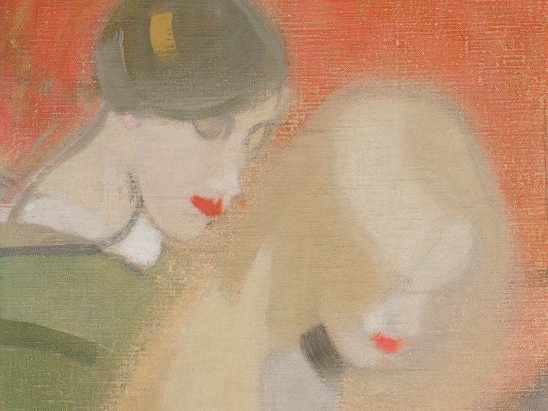
When in search of inspiration, I return often to a small Japanese handbook I got as a gift, as it contains page after page of color combinations and tone groups to make pairing easy and provide inspiration. I have several idols among skillful users of color, such as the Finnish artists Inka Bell and Juhana Blomstedt. Art in general often offers a wonderful playground for color use, pushing the boundaries of imagination and propriety while always remaining safely within its own confines.
I fall in love with different tones every now and again. At the moment, I’m pretty much addicted to a cardigan worn by a character called George Costanza in several episodes of the American sitcom Seinfeld – to me it’s the perfect shade of moss green. The ultimate source of inspiration for colors, however, is nature itself. Only in a meadow could there be so many colors and tones at the same time while still looking harmonious and purposeful.
Nevertheless, the color scheme of the living environment I have created for myself will continue to be inspired by tuberous plants covered in soil. As my home is being renovated, I have recently had a lot of choosing to do when it comes to colors and tones. A few weeks ago, I was at the hardware store looking for a suitable paint for clothes closets. I declared that for once in my life, I’d be bold and follow my intuition in choosing some really audacious color. Satisfied with having indulged my impulses, I returned home happily with a tone that I would now describe as light beige. As I said, color isn’t easy.

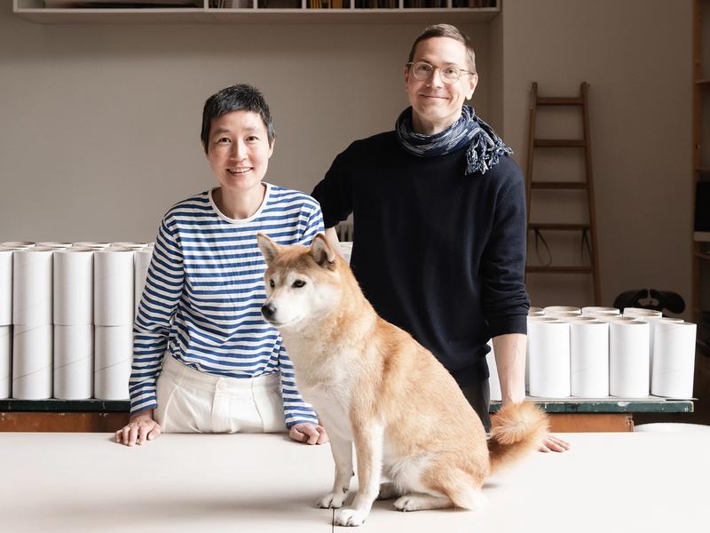
The author, Hanna-Katariina Mononen, reflects on the issues of a beautiful and sustainable life in her monthly column for Design Stories. She thinks that just like in life, in the home, the most beautiful parts are unplanned – and often relatively ordinary as well.
Text and image: Hanna-Katariina Mononen
Published on 28 Dec, 2021