Quietly glowing colors – In Helene Schjerfbeck’s palette, it’s about being human
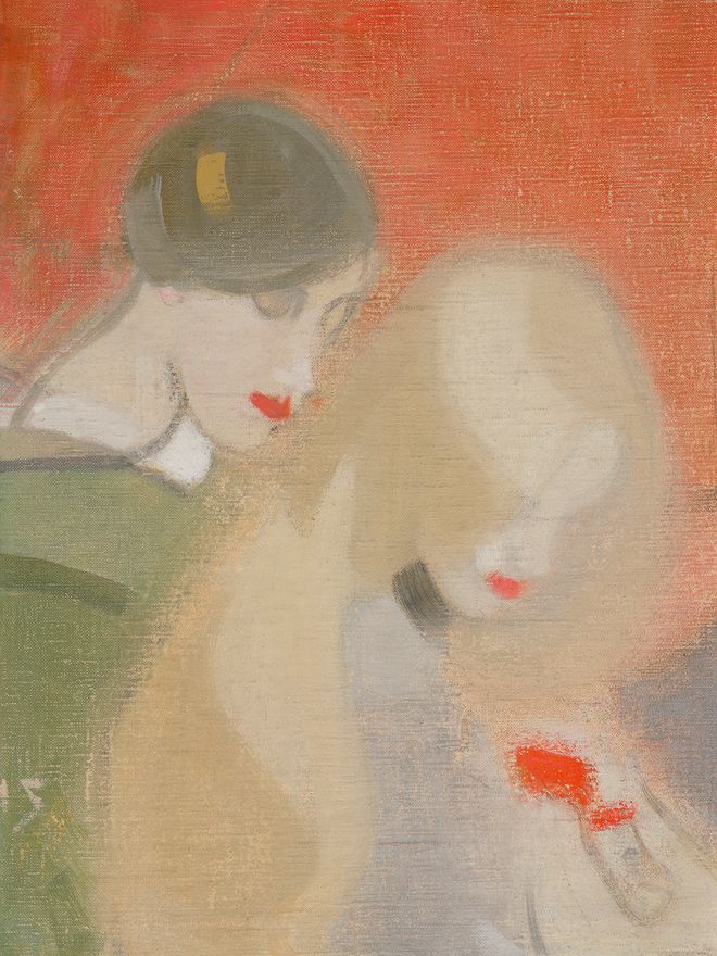
The Family Heirloom, 1915–1916, by Helene Schjerfbeck. Photo: Finnish National Gallery / Jenni Nurminen
I ENJOY VISITING old acquaintances. At the Ateneum Art Museum in Helsinki, I’ve had many rewarding conversations with works by Helene Schjerfbeck (1862–1946).
It’s worth pausing in front of familiar works. Each time, I can focus on different dimensions or simply let attentive looking condense into a kind of stillness I hadn’t noticed before.
Sometimes, however, familiar works are not there to be met. At the moment, many of them are on loan in New York, at The Metropolitan Museum of Art’s exhibition Seeing Silence: The Paintings of Helene Schjerfbeck.
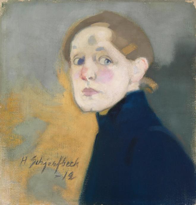
Self-Portrait, 1912. Photo: Finnish National Gallery / Yehia Eweis
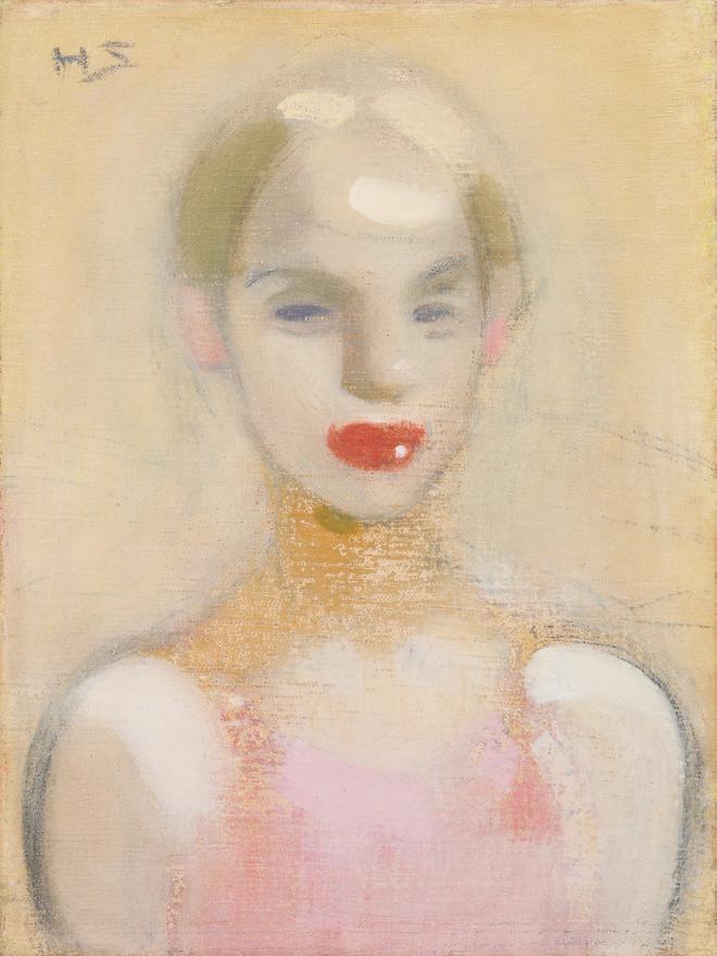
Each time I look at these works, I discover something new, if nothing else, about myself. Schjerfbeck’s Self-Portrait (1912), painted when she was fifty, awakens very different thoughts and emotions in me now than it did when I was a twenty-something art history student.
When I look at the absorbed, red-dressed child at play in Girl on the Sand (1912), I feel a sense of longing. As a mother of children who have already passed the age of play, I grieve the end of my own children’s childhood, and reflect on how increasingly difficult it has become, amid today’s constant flood of stimuli, to recognize the significance of fleeting moments.
When I was younger, the lavender-blue shadow traced in the sand carried me back to the endless summers of my own childhood by the sea, where the shadows of sand dunes glowed in the same hues.
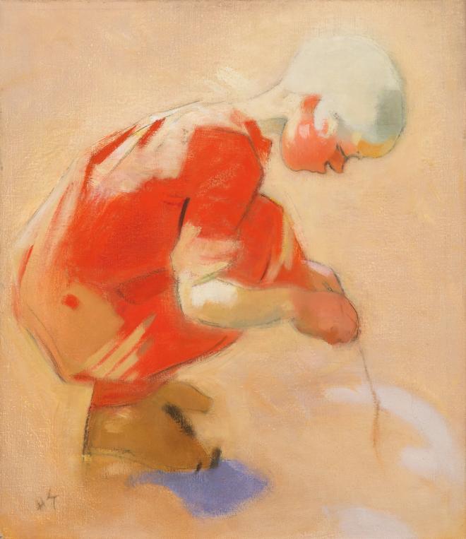
Girl on the Sand, 1912. Photo: Finnish National Gallery / Yehia Eweis
In front of Schjerfbeck’s works, I breathe in color. The muted greens characteristic of her art, the warm tones of sand and ochre, and lavender blue, along with the bright, glowing accents of orange, red, vivid blue, and pale pink in her works from the 1910s, shimmer within the paintings’ quietness. White and black, too, are essential parts of her palette, where each shade carries its own charge.
In front of Schjerfbeck’s paintings, color is never loud. Muted greens, warm sand, and lavender blue carry their meaning quietly, asking the viewer to slow down and look again.
The delicate yet intense painterly language typical of Schjerfbeck’s modernism guides the viewer toward what is essential. As her use of color moved away from the imitation of nature, colors were freed to express their own inner being. Schjerfbeck developed a painting technique that emphasized the materiality and self-sufficiency of the work. Color found its voice in her paintings, where thickly worked layers applied with a palette knife alternate with passages that are almost wiped away.
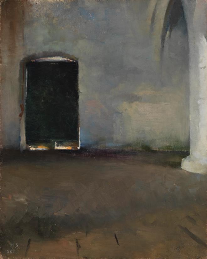
The Door, 1884. Photo: Finnish National Gallery / Yehia Eweis
The power of Schjerfbeck’s colors lies in their relationships and balance. In the dramatically reduced The Door (1884), painted as early as the 1880s, the stark confrontation of light and darkness is ultimately about something far more than the depiction of a vaulted room and an intensely black door.
A constantly renewing artist, Schjerfbeck explored the use of color throughout her seventy-year career, continually reducing her palette. In Red Apples (1915), the orange and red tones still glow sensually. In works from the same period, such as Family Heirloom (1915–1916) and Circus Girl (1916), the inner tension of the paintings arises precisely from the juxtaposition of earthy and pastel color fields with brightly glowing details, the red of a ruby and the full red of lips.
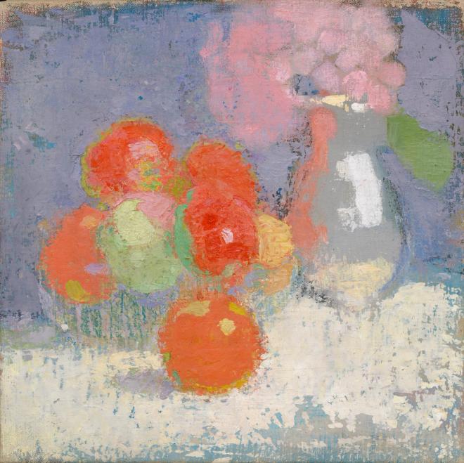
Red Apples, 1915. Photo: Finnish National Gallery / Hannu Aaltonen
Circus Girl, 1916. Photo: Finnish National Gallery / Yehia Eweis
Over the course of the twentieth century, the artist’s relationship with color changed. In 1938, she wrote to her friend, the painter Helena Westermarck: “Pure colors, that is false. In nature there is never pure color, except in the rainbow, which is not beautiful.”
As Schjerfbeck moved away from imitating nature, color was freed to speak of something more essential.
Even as Schjerfbeck simplified here as well and set aside nature’s own color accents, dandelions and poppy fields, I take joy in the fact that she continued to explore color and carried her discoveries into works that speak powerfully through their very restraint.
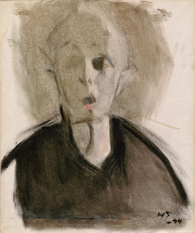
Self-Portrait with Red Spot, 1944. Photo: Finnish National Gallery / Hannu Aaltonen
In her thinking and her art, Schjerfbeck moved from the rainbow into deeper waters, leaving behind reflections that speak the same language as her work: “I think that only a return to simplicity and calm, to modesty, can save the world. But in the end, isn’t everything an inner life, while the external slips out of our consciousness?”
In her final charcoal self-portraits, all that remains of Schjerfbeck’s colors is black and white – light in darkness, so essential to human life.
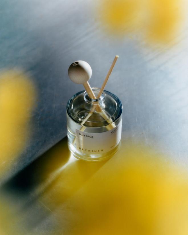
The Soft Sage scent diffuser by Hetkinen brings a multi-sensory finishing touch to any space. Photo: David Jakob
Discover the Tones of Modernism
THE COLOR WORLD of Helene Schjerfbeck’s paintings also served as inspiration for the Tones of Modernism home collection, created in collaboration between Finnish Design Shop and The Metropolitan Museum of Art. The collection celebrates Schjerfbeck’s exhibition in New York and brings modernist color thinking into objects for everyday life.
The collection features five Finnish design brands: Artek, Iittala, Nikari, Lapuan Kankurit, and fragrance house Hetkinen. Across the collection, the same sense of quiet elegance is present in every piece. Muted tones and carefully considered details echo the restraint and sensitivity that define Schjerfbeck’s art.
See also:
• The Tones of Modernism collection >
Published on 5 Feb, 2026