Iittala’s new Solare collection captures the power of the sun
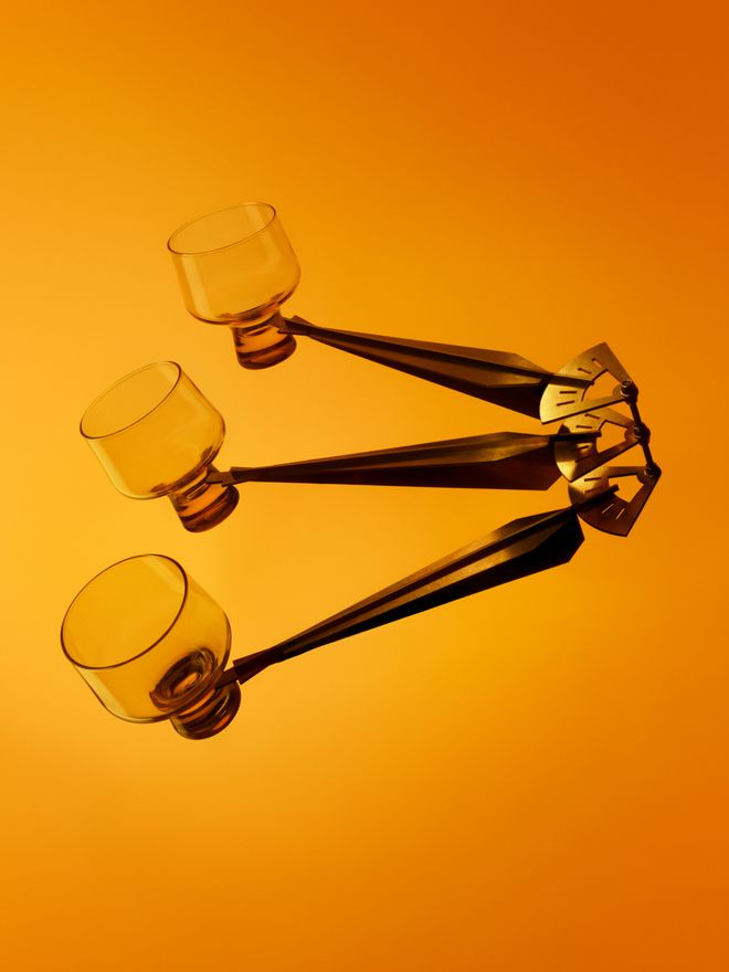
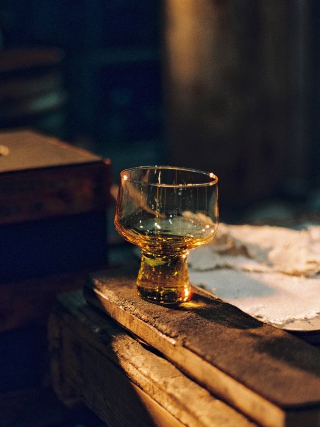
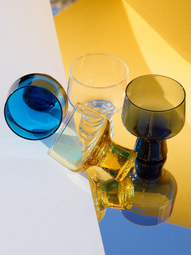
In the Solare collection, light takes on a physical form. Sunlit yellow was a natural choice for one of the hues of the Solare glasses.
IITTALA’S SOLARE COLLECTION follows in the footsteps of Kaamos, Finnish for Polar Night, a previous seasonal collection that explored the deep, dark tones of Nordic winter. Now, Solare shifts the focus to the boundless energy of the sun. This spring/summer 2025 collection is a tribute to the sun’s power, growth, and vitality – a force that inspires both the colors and forms found throughout the collection.
With its bold electric blue and sunlit yellow, Solare features mouth-blown glassware and vases, embossed ceramic tableware, and a selection of home decor pieces. Along with the unique qualities of light in the North, its curved shapes and crisp aesthetic draw inspiration from Finnish design heritage.
Design Stories spoke with Iittala’s Creative Director Janni Vepsäläinen, who led the vision and development of the Solare collection.
• Read also: Janni Vepsäläinen is steering Iittala towards a new era >

Iittala’s Creative Director Janni Vepsäläinen, who draws inspiration from dualism in design, led the Solare collection’s development.
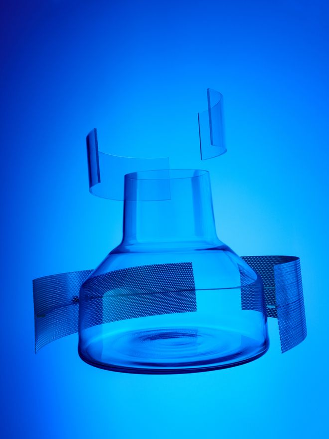
The Solare vase in electric blue adds a cool contrast to the collection.
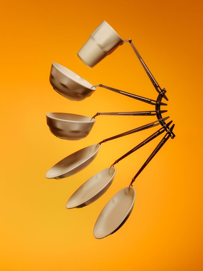
Beyond glassware, the collection includes ceramic plates, bowl, and mugs with textured, embossed surfaces.
Hi Janni! Can you tell us about the design philosophy behind Solare?
“At Iittala, our collections are built on contrasts. I’ve always been drawn to the duality in design, and that perspective has only deepened through my research into Tapio Wirkkala and his design philosophy, which is grounded in the principle of opposites. Inspiration should come from both nature and industrial expression. You need bold colors to make space for the dark, earthy tones to resonate in turn.
Great design exists in the tension between contrasts, just like in Finnish nature. My vision was to capture Iittala’s unique relationship with the ever-changing light of the North. Darkness and abundant light constantly alternate in our environment, and that story of light is something Iittala’s collections will continue to explore.
“Great design exists in the tension between contrasts, just like in Finnish nature.”
Kaamos, launched in the fall, was inspired by the dark season. As its counterpart, I wanted to create Solare – a collection that, true to its name, is the opposite of Kaamos, inspired by light and the sun. Bold colors and a design language rooted in industrial aesthetics became the foundation of this collection.”
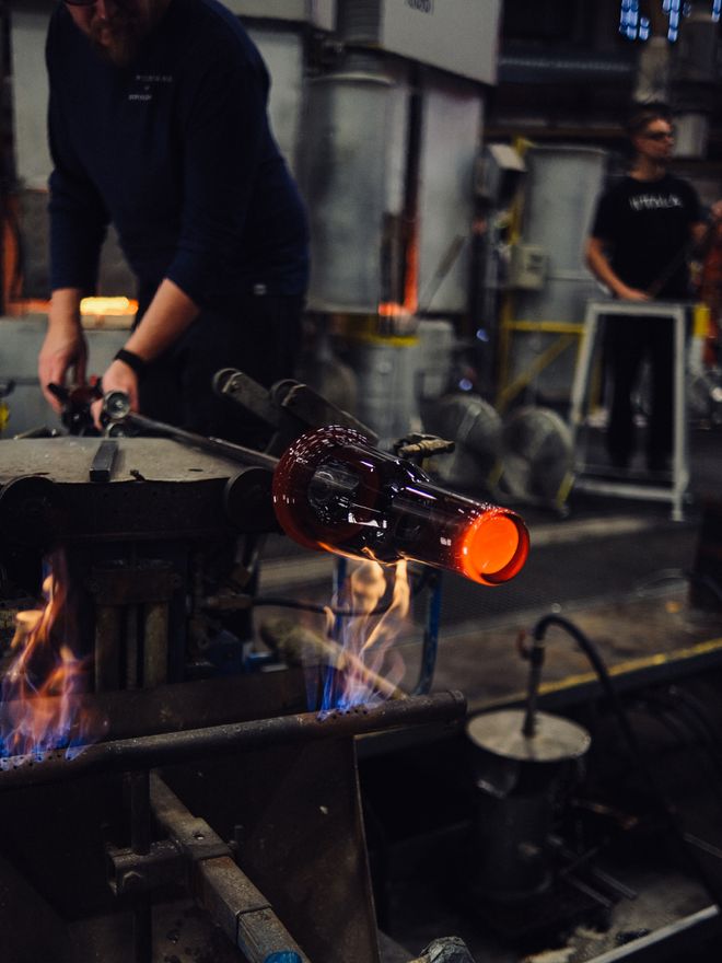
The lead-free glass is made from fine Belgian sand, creating a flawless, crystal-clear surface.
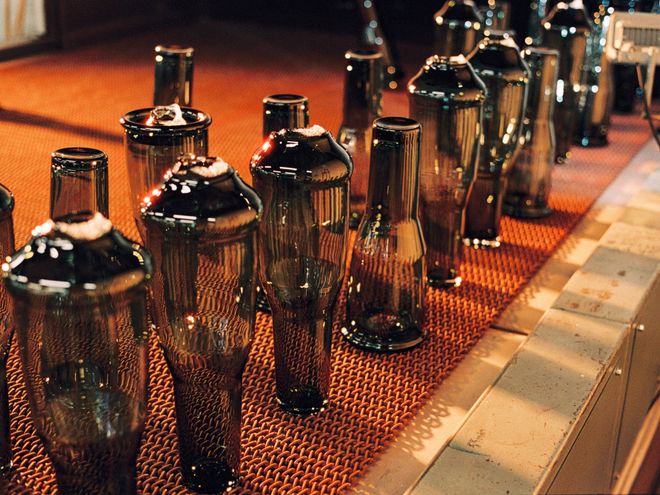
The final shape of the glass pieces is achieved using custom molds and precise blowing techniques.
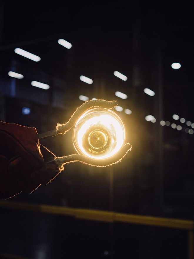
All Solare glassware and vases are mouth-blown at the Iittala Glass Factory in Finland. Iittala has a century-long tradition of producing colored glass.
“We created modern forms with smooth curves. The way the designs interact with light gives each piece a futuristic precision while ensuring functionality,” says Harri Koskinen, Design Development Lead at Iittala.
How would you describe the design and production process of Solare?
“The collection was designed under my direction by Iittala’s in-house design team, using materials characteristic of Iittala and a palette of strong primary colors. Custom molds were created for the Solare glass pieces, allowing them to be mouth-blown at the Iittala Glass Factory in Finland.
My design philosophy is rooted in close collaboration with artisans – in this case, glassblowers. Every other week, I’m at the glass factory, where we refine product ideas, challenge production possibilities, and solve technical challenges.”
How did you choose the colors for this collection?
“I wanted a palette of strong primary colors inspired by modernism, particularly the Bauhaus movement and Kaj Franck’s legacy. The colors are drawn from the light and space around us.”
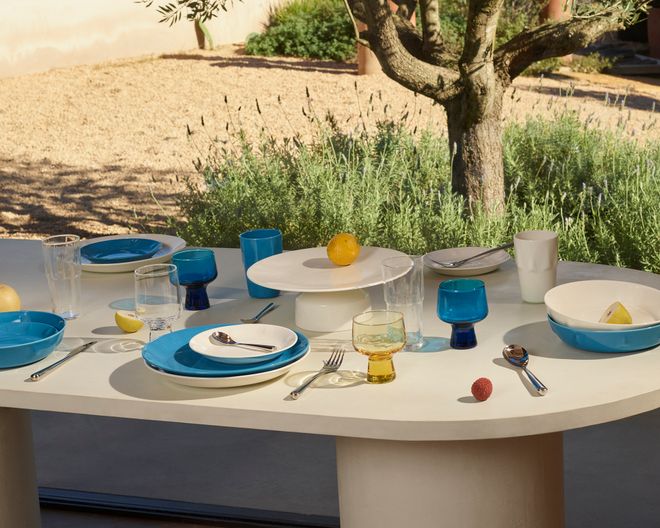
The ceramic tableware mirrors the color palette of the glass collection. Bright hues are balanced by neutral tones, such as the white serving tray.
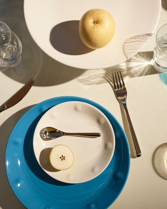
The Solare plates feature raised dots along the edges, adding texture to the design.
The new seasonal colors are available for a limited time only.
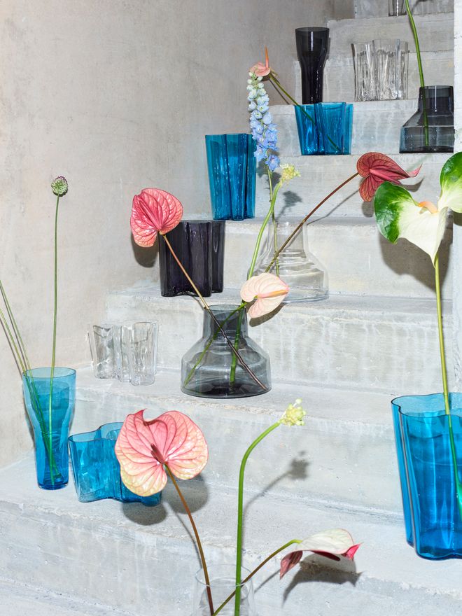
Solare vases come in two different shapes: a low vase and a tall vase.
It’s been a year since Iittala’s brand renewal. How does Solare reflect the new Iittala? And the old?
“Solare is bold, experimental, and modern, yet deeply rooted in Iittala’s design history. Iittala’s history reflects both Tapio Wirkkala’s nature-inspired design language and Kaj Franck’s signature approach, rooted in geometry, basic shapes, and primary colors.
Stackability, functionality, versatility, and timeless design are at the core of everything we do – and Solare is no exception.”
See also:
• Iittala’s Solare collection at Finnish Design Shop >
Text: Nora Uotila Images: Iittala
Published on 21 Mar, 2025