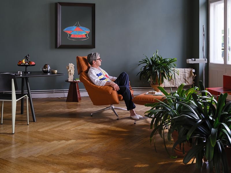
Top chef Yotam Ottolenghi’s Feast collection is all about the colorful joy of sharing
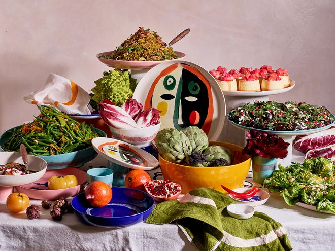
Serax’s freshly released Feast collection was specially developed for shared dishes.
ENJOYING, RELAXING AND GETTING TOGETHER are the cornerstones of Serax’s new tableware collection Feast, which came to life in the fall of 2022. An intriguing play of bold colors and contrasts, the collection was initiated by the British-Israeli chef Yotam Ottolenghi, whose unique approach to food is reflected throughout the collection.
Yotam Ottolenghi is an awarded chef, co-founder of seven London-based deli restaurants, author of nine bestselling cookbooks, and a TV host who has appeared as a guest judge in Masterchef Australia. He is also a weekly columnist for the Saturday Guardian and a regular contributor to The New York Times.
Ottolenghi recipes draw influences from all over the world, especially from the Middle Eastern and Mediterranean kitchens. These recipes also paved the way for his first tableware collection, which was developed to match the Ottolenghi concept of shared dishes, as well as the brand’s aesthetics.

World-renowned chef and food writer Yotam Ottolenghi opened his first deli back in 2012.
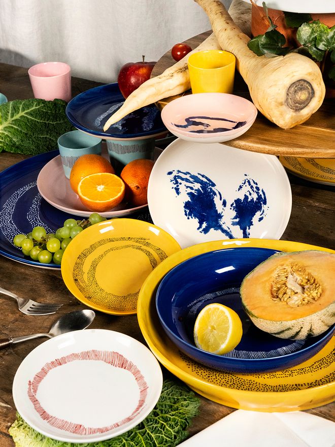
The color scheme of the Feast plates draws from Middle Eastern and Mediterranean kitchens.
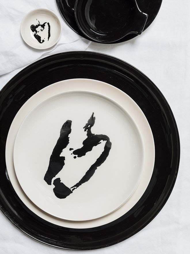
Feast plates are also in use in Ottolenghi restaurants in London.
Intensity and exuberance
The Feast collection’s color and pattern scheme were developed by Ivo Bisignano, a Sicilian artist and close friend of Yotam Ottolenghi, as well as the creative force behind the visual expression of the Ottolenghi brand.
“Working with Ivo, we always knew the collection will have to be a riot of colours, echoing the food we serve, which is always multi-layered and full of contrasts. There isn’t one kind of Ottolenghi recipe or dish, just like there isn’t one kind of plate in Ivo’s collection. Yet there is definitely a thread of intensity and exuberance,” Yotam Ottolenghi describes.
According to Ottolenghi, designing his own tableware collection was a real dream come true. The best part of the design process was, however, seeing the designs turning into actual objects.
“Appreciating food is a holistic experience which involves all the senses.”
“Seeing the dishes come to life, gradually, in a way that deeply understands food and how it is presented on a plate was great fun. The first time we actually served food on the dishes of this collection reminded what I have always known: that the way food is presented is as important as its taste; that appreciating food is a holistic experience which involves all the senses.”
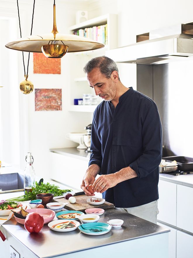
Yotam Ottolenghi is a well-known TV personality who has hosted three cooking shows and appeared as a guest judge on Masterchef Australia.
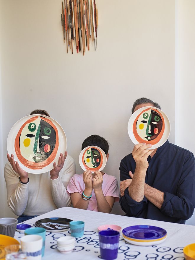
These face-themed Feast plates reflect artist Ivo Bisignano’s attraction for bold, dynamic motifs.
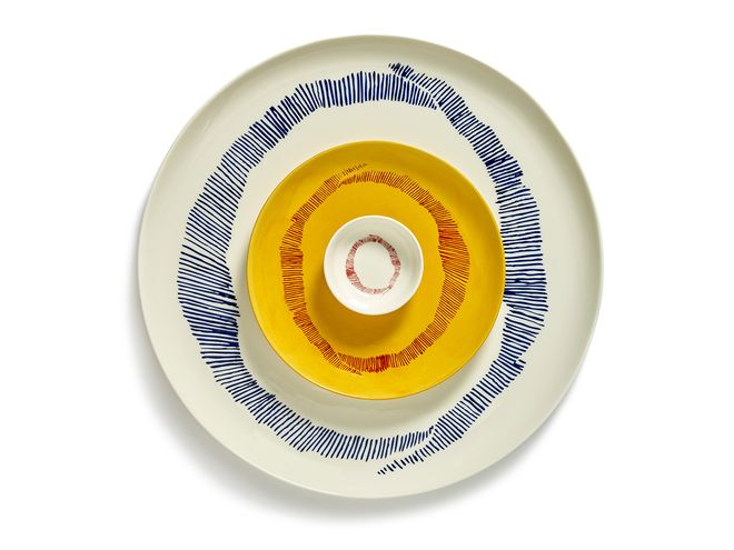
According to Ivo Bisignano, the O pattern has many meanings: it is the shape of a face, a circle, a symbol of the continuum – and, of course, the O of Ottolenghi.
If the Feast collection could be encapsulated into just one Ottolenghi recipe, which would it be?
“It will have to be the French beans and mangetouts with hazelnut and orange. This is an Ottolenghi classic, published in the first Ottolenghi cookbook in 2008 and often appearing on our menus, mostly during the autumn holidays. It looks as wonderful on a large platter as it does in a small bowl, alongside other vegetables. There is something very honest about the dish, as there is in Ivo’s plates,” Ottolenghi sums up.
Feast of eclecticism
The Belgian brand Serax was chosen as the manufacturer of the Feast collection because its creative vibe matched perfectly with the Ottolenghi approach, says Creative Manager Jan Aerts from Serax. Due to the pandemic, the collaborative design process was largely carried out online.
“We had one physical old-school meeting at Serax, but then Covid took over. From March 2020 to September 2021, we managed to do everything with video calls and sending over lots of samples and drawings. Crazy that it worked so well. There was in a way more focus because we had to be very precise and clear in the many many video calls,” Aerts explains.
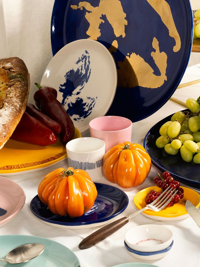
Small Feast plates are especially suitable for serving appetizers and dips.
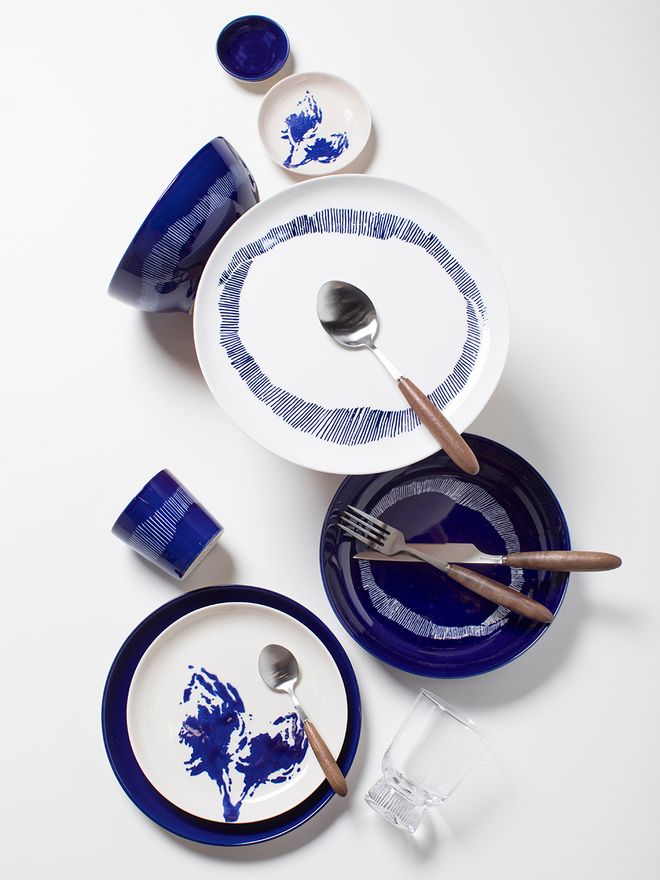
The Feast collection also allows for calmer color combinations, for example in fresh blue and white tones.
According to Aerts, the most difficult part of the design process was the wild, eclectic nature of the collection: the designers wanted the tableware to represent a mix of flea market finds and classic dishes at the same time. Another challenge was the actual manufacturing process itself.
“Many of the stamping processes are done manually, so every plate looks a bit different.”
“Translating the vibrant look of the colours into consistent high-quality glazing on the plates was a challenge. All the stamping techniques on top of the colors were a real experiment. Many of the stamping processes are done manually, so every plate looks a bit different. The glazing is not sprayed but painted by hand to create little imperfections. These little imperfections create a more vibrant effect altogether.”
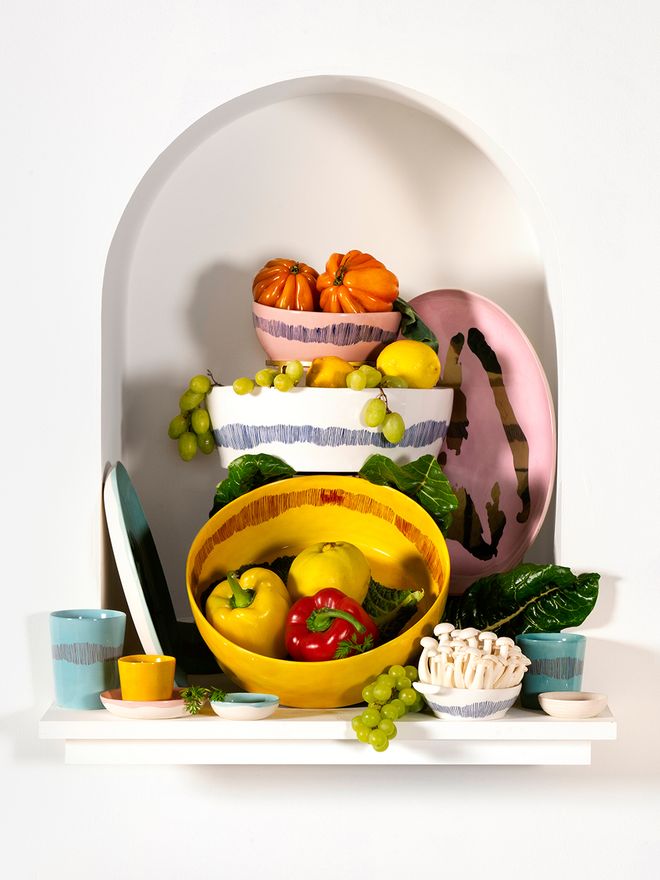
Perfect for serving large salads or main courses, the yellow salad bowl brings a touch of sunshine to a table setting.
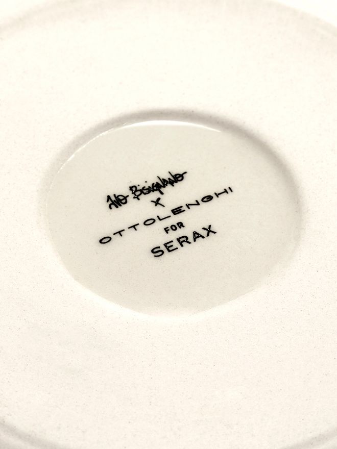
The plates are finished with a hand-painted glaze.
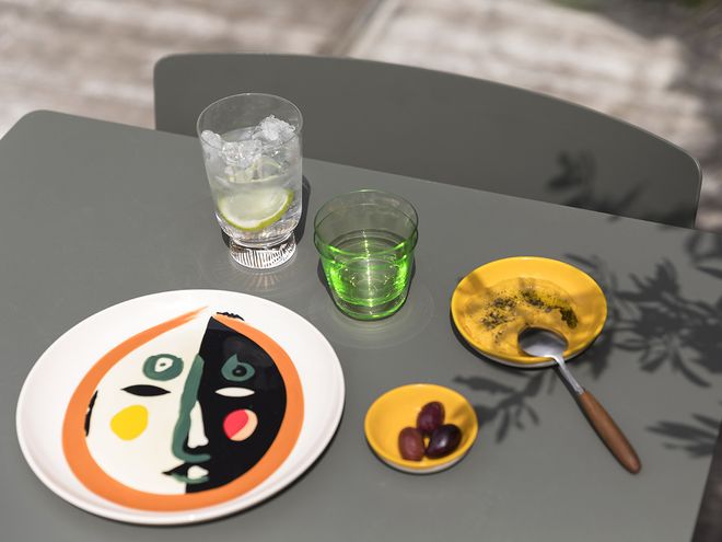
In addition to plates, Yotam Ottolenghi and Ivo Bisignano also designed cutlery and glasses for the Feast collection.
Aerts was especially impressed by Ivo Bisignano’s skill in combining colors and shapes that, at first glance, seem to be not matching at all.
“He combines them in such a way, that it becomes a really strong image that catches the eyes in a beautiful manner. The Ottolenghi brand is about happiness, sharing, coming together… Colours are very important in creating this feeling of togetherness.”
See also:
• Serax’s Feast by Ottolenghi collection >
Text: Nora Uotila and Serax Images: Serax
Published on 24 Nov, 2022